Thursday, May 7, 2009

Critique Response: Google Earth/final project

I really enjoyed our final critique. I think that there were a lot of amazing projects, with a wide range of use of google earth and sketchup. I also think we chose different angles to use the map--some made it an emotion-tied map, some connected the land on St Marys to something different (the stars, the body) and some made super-creative lenses through which to view the campus. 
I am also really happy that there was a lot of positive response to my map. I wanted to re-create my own experiences with food on campus, which are wide-ranging and not typical of all St Marys students, though I do share a lot of things with the campus as a whole, like the great room or free food from lectures. I also include a lot of unique experiences and information, such as dumpster diving, the health co-op, and picnicking in historic. I also have different associations and connections with some of the places on campus; Caroline, which has vending machines, will also be linked to Metallica for me since that is what my friend Mike plays while we're eating pizza in his room. The boathouse is connected to the Polar Bear Splash, which I helped organize, as well as sailing and free food in the new boat house. I also wanted to include more than one sense in the map, which is why sounds and songs are sometimes included in the placemarks. I also included an interactivity, and information. Some links take the user to websites, one takes them to my own journey project. With this map, I can hopefully explain and share these experiences I have had regarding food with others. 
I thought Bartoz's comment was very interesting and useful--if I brought in more information, like how I did when talking about dumpster diving, it would allow for an even better sharing of my experiences. Recipes, tips for free food, and even rating certain foods in vending machines or the great room would be an awesome addition, and make my map more of an information hub for the campus. I considered doing my project in this vein originally, mapping out all the vending machines and all the free food locations on campus, but I also wanted to skew it to show my perspective of campus, so the user sees how I eat on campus. (How egocentric!) I think that is why I include non-food related objects, like the townhouse pond, with links to photos I've taken of ducks, or the atmospheric moon and ocean sounds of the point. So if I did add more information, it would be very Tara-centric information, like my favorite recipe to cook in the co-op, or the cost of my favorite chips in the vending machine. 

Monday, May 4, 2009

Artists: marek walczak & martin wattenberg, Apartment


I was looking at everyone else's blogs, and I noticed a lot of posts about the apartment link. I decided to check it out since it seemed like this piece was also working with mapping space and ideas through blueprints, and I'm still searching out other projects that are mapping space with ideas like my final project. 
Oh my goodness, this site is amazing. The premise is that the user types a sentence, or a word, and based on the words, it creates rooms in a blueprint of an apartment. "I was thinking about an apple" will create a bedroom, library and kitchen. Within the blueprint, "I" will float around the bedroom space, "was thinking" will float in the library, and "apple" will go to the kitchen. 
I was impressed, but when I went to see the 'favorite apartments' that other users have created, I was blown away. One, titled "paradise paradise paradise" had a whole bunch of typical words to describe a beach vacation; "water", "fun", "sand", "clear", "beach", etc. The words move in a patter, though, in the room, so a window full of clear, sand, and sun rotates in cylinder, while water slowly drifts in the kitchen, and the words in the living room bounce from corner to corner. My favorite is probably one called "light light light" which is just a window space, filled with the word light twisting in what reminds me of a tornado. The words, which represent ideas, go beyond just the face-value meaning and with the shape and motion they create, add a new dimension. Kind of reminds me of our letter project, where we try to use our letters to create a poster that includes a representation of historic meaning of our letters. 
These apartments remind me of the pshychogeography readings. The apartment can be a map of our minds, our thoughts, or maybe I could map the first paragraph of Little Women into a blueprint. It's a connection of thoughts, visualized through words, further visualized into a blueprint, and animated by motion and patterns (and repetition of words). 

Sunday, May 3, 2009

Artists: GH Hovagimyan, Love Songs from My Computer


My mac has many synthetic voices, and they are very interesting to play with, and I even set up voice notification for my instant messaging client on the computer, with different voices saying different words when my friends logged on. Love Songs from My Computer reminds me of this, as Hovagimvan has taken popular songs and had synthesized voices sing them. The clips are open in one window, so the user can play multiple clips, creating layers to the song. The artist is not a trained musician but is willing to cross lines between digital art and music, to create something that is a hybrid of the both. It reminds me of Pat's presentation when he came to visit my color theory class, where color and images were translated into sound, and vice versa, to create a dialogue between sound and image. Love Songs is a dialogue between digital voice and human, industry presentation and our own ability to mix and remix these songs. 

Artists: EcoArtTech, Eclipse

 ->

Eclipse shows users how air pollution harms national parks, even when we cannot see it. It takes a photo from flickr from a park that the user designates (The one above is from the Santa Fe National Forest), and then applies the real time air quality to distort or edit the photo, similar to how air pollution alters the atmosphere of these parks. The picture above is a 'good' air quality.
I love the environmental consciousness of these altered photos, and how it even re-uses currently existing photos (taken from flickr) to show the aftereffect. The combination of sources and way the user chooses the location hopefully create a piece of art with an impact on the user's mind.

Artists: Warren Sack, conversation map, and the visual thesarus


While working on my final project, I have been thinking about mapping places a lot. These two site visually map conversations, and words. The thesaurus is interesting because it groups words in clusters according to meaning--it is a much more efficient way of finding words, and then jumping to new words. It reminds me a lot of the Baltimore County Public Library search, which visually shows you results you can modify. 
The conversation map is a much more in-depth version of those maps. It is a Usenet
 newsgroup browser that searched through the threads on the soc.culture.albanian newsgroup, and organized the conversations happening within that group. It indexes the threads by themes, threads, and who is discussing them. you can then expand the words describing a theme into the full thread.
It also is, to me, an interesting study in social relations on the internet--I would like to see this applied to livejournal or facebook, or twitter! This also gives me food for thought in organizing my thoughts on St Mary's into a map for my final project.

Artists: Matthew Ritchie, The New Place

 Matthew Ritchie's website, The New Place, is a continuation and bridge of his former project, The Hard Way. The Hard Way is an interactive environment in which the user follows a character, the story and interactions that occur. The New Place is similar in that it also explores the interactions between three characters: the actress, the swimmer, and the golem. These three characters are metaphors for three elements, which are primary in the carbon-oxygen weathering cycle.  Because of this, the narrative plays out on a number of levels, not only through story telling but through a scientific narrative. Apparently, The New Place is only a prototype, and I eagerly look forward to seeing the full site. I was also captivated by the clean graphics, and the direct flash narration. I really enjoyed the visual storytelling the site used, and I like the idea of using digital animation to tell a story.

Saturday, April 25, 2009

Artists:©Bots

 ©Bots  is and interactive website focusing upon copyright issues. The website claims that with the internet, corporations "compete for your attention, for access to your memory, fertile ground where they can install their memes." The user can create a ©Bot to protect the "valuable real estate" of their mind. a ©Bot contains pop culture references, but the user creates them into a contradiction, to get rid of entrenched memes and bring the subconscious thoughts and icons created by corporations to a conscious, alterable level.
I really enjoyed the interactive level of this site: pictured is a ©Bot that I created. But I think the website uses the interactive, fun game aspect of the creator to get across a message about the insidious use of logos and images copyrighted by corporations. There is also a sharing portion: a gallery allows users to save and share their ©Bots for others to enjoy.

Tuesday, April 14, 2009

April is national poetry month, so I thought I'd share this dorky poem.


The Symbolic Poem
by Fred Bremmer and Steve Kroese

< > !* ' ' #
^ " ` $$-
!*=@$_
%*< > ~ #4
&[ ]../
{,,SYSTEM HALTED

This poem can only be appreciated by reading it aloud:

Waka waka bang splat tick tick hash,
Caret quote back-tick dollar dollar dash,
Bang splat equal at dollar under-score,
Percent splat waka waka tilde number four,
Ampersand bracket bracket dot dot slash,
Vertical-bar curly-bracket comma comma CRASH.

A poll conducted among readers of InFocus magazine, where it was originally published, established "waka" as the proper pronunciation for the angle-bracket characters, though some held out resolutely for "norkie".

Saturday, March 14, 2009

A to Z critique response

After discussion my ideas with the class, I think I'm going to follow through with the holistic idea of bread, water and shelter. I'm really glad Pat suggested that I use the H building as a structure to hold the other two letters, that will tie it in a lot better. There's also the fact that H is my family name, and logically the one that would be biggest and hold the rest of my name within it. I'm not sure how literal I'm going to be with the symbols I use-- the poster I am working on now has pretty derivative versions of the letter, but perhaps in one of the other posters I'll make a more literal versions of the letters. 

Tuesday, March 10, 2009

Artists: Etoy.com

Etoy.com is the result of a group of European artists who created Swiss corporation whose purpose is to make art out of mimicking the corporate world. The site was set up in 1995, and on the site, users could buy stock, and stock certificates would be the art. I think this is also represented in the name of the website-Users use the website like an electronic toy, and the site is mocking corporate culture by calling what they do a toy.
 
One of the most interesting things I learned about Etoy.com is that it had a domain name battle with Etoys.com in 1999, which Etoy named Toywar. eToys tried to buy out the Etoy domain, but Etoy refused, so eToys sued for copyright infringement. Etoy created an online game in which members could attack eToys and earn points through real-world activities against eToys. Nearly 2,000 people participated in Toywar, and in January 2000, eToys dropped the lawsuit. Etoy takes credit for the $4.5 billion decrease in value of eToys's stock, making Toywar "the most expensive performance in art history". 
 
I love how Etoy is mimicking, twisting, and mocking the corporate world and structures by which it operates. It even came out to the non-digital world with the eToys lawsuit. How Etoy used that real-life lawsuit to further involve users in a game, which then was taken off the website to chatrooms, forums, and other user-created websites is a really innovative use of New Media Art. Etoy shows me how with the internet, it is so easy to have the same power that large corporations have, no matter who I am behind the computer screen.

Wednesday, March 4, 2009

Critique Response: Journey Project

Journey Project Start (viewed best in Safari)

I wanted to create a journey project that kind of got the viewers lost within the site in a journey, so that they may have to re-experience certain pages, like Nobodyhere.com or Jodi.org does. I created that journey with the underwater path--the foot that wanted to go on an adventure. I liked the fact that I would be holding my audience captive in a way, so that it wasn't just a linear journey to the end, and then they were done with it. I'm glad that the class understood what I was trying to do with that, and that it was an effective piece in that way.

One suggestion that I was given was to clarify some of the pages, where you weren't sure where you could click. So, in some pages, like the surfing girls and the baseball player, I added more photoshop graphics that popped up on rollover, to show the different areas one could click on, and that way you had a bit of an idea of where you had been if you were still travelling the circutious loop of the pages. I also tried to unify the pages and images better by giving each page a background, derived from a predominant color in the image.

As for the second journey, the foot that stays at home, I wanted to make this a more direct route. There is a parallel in that you are exploring something (a computer or under water), but I wanted the second journey to differ in that it is more narrative, I address the viewer through text and tell them where to click many times. The computer journey is more literal--I used real images of the insides of a macbook pro, whereas for the underwater journey I took images that were fanciful underwater photography. To reflect the more literal nature of the computer journey, I made the path more straight and assigned myself the role of narrator through the internet.

I really enjoyed this project, and I had pretty high standards for myself when creating the journey project. I wanted it to be entirely engaging to the viewer, something they interacted with and explored not only through seeing the elements and guessing where to click, but with audio as well. I even tried to think of witty titles for each page. Mostly, I wanted to create a website and art piece that will stand on its own outside the context of this class, so that I can take it to my friends or family or strangers, and they can simply enjoy the experience of the journey, without needing to know I created it for a class.

Tuesday, March 3, 2009

Album cover

So I tried out this internet meme:

1 - Go to "wikipedia." Hit “random”
or click http://en.wikipedia.org/wiki/Special:Random
The first random wikipedia article you get is the name of your band.

2 - Go to "Random quotations"
or click http://www.quotationspage.com/random.php3
The last four or five words of the very last quote of the page is the title of your first album.

3 - Go to flickr and click on “explore the last seven days”
or click http://www.flickr.com/explore/interesting/7days
Third picture, no matter what it is, will be your album cover.

4 - Use photoshop or similar to put it all together.

I thought this was kinda neat, a little New Media, and I got to work in Photoshop to create it!

Monday, March 2, 2009

Artists: Yael Kanarek, World of Awe, The Traveler's Journal

Worldofawe.net, the Traveler's Journal is a New Media art webpage that centers around storytelling and narrative via the idea of the journal. The viewer is placed in an interface similar to a computer's desktop, where hidden in the desktop icons and menubar are links to journal entries, stories, images, and interactive pages where the user has to figure out a puzzle to get the next piece in the narration. The premise of the website is that you have found this laptop, belonging to an anonymous journeyer in a desert land called Sunrise/Sunset, and the files in the laptop allow the viewer to explore the electronic thoughts and love letters of this lost person. In the background, a loop of blowing wind is played.

This project is very reflexive, the viewer is placed in a layout that mimics a computer desktop, and is then explored in desktop icons and the menubar, just as you would explore your own computer. I was drawn to this, and to the ability to explore and gain a story from my exploration of the site. The interactivity of the user with the site is what creates the narrative in this project

A to Z project research

I looked at the Phoenician script to find meanings for my initials at first.

T- "Taw" was originally a cross, more like an "X" than a "T". It literally meant "mark", and indicated a signature. Taw was also the last letter of the Phoenician alphabet, and had a significant role as that. It would be used to signify the end of things.

N-"Nun" was thought to have come from a hieroglyph of a snake, or possibly an eel or fish in water. The snake hieroglyph means "bad luck" in Arabic.

H- "Heth" originates in a hieroglyph for "courtyard", and is written the same in early
Greek, when it meant "fence"
Amusingly, I found the hebrew derivation of Heth, Chet, is used in chatrooms to designate laughter, similar to LOL.


Outside of the Phoenician alphabet, I found that the Egyptian nu was a wavy line that represented water, similar to N. T reprsented a loaf of bread, and H represented shelter.


"T N H" in hieroglyphs.

I
think that even though I did a lot of research into the Phoenician alphabet, I am more drawn to the Egyptian hieroglyphs. It's older, some of the Phoenician is derived from these hieroglyphs, and there is a uniformity with bread, water and shelter-- they are basic needs for survival, when summarized.

So, working in Illustrator, I threw together some literal transcriptions of the Hieroglyphs and my letters:

T was the easiest: a loaf of bread, easily replicated as a pattern on the letter.


N was more difficult, and I came up with a couple ideas. The font I used for the letter 'N' was very curly and made me think of the movement of water, which is why the second gif is just blue wavy and curly lines. I also mimicked the hieroglyph's shape of water. Then, I tried to emphasize where the "N" shape could have come from in the shape of the waves and water.


I would say I have the least ideas for the H. I tried the hieroglyph's shape of 'shelter', and elaborated on it to make it a more complex shape, and then drew a symbol version of a house.


Tuesday, February 17, 2009

Artists: Dennis Hwang, Google logos

When I was in high school, I vowed to marry Dennis Hwang, the creator of the google holiday logos. Hwang did not create the ubiquitous google logo that everyone sees on an everyday basis, but he creates the special holiday logos that show up on random days such as Jackson Pollock's birthday, the 50th anniversary of NASA, and the World Cup as well as more 'traditional' holidays such as Christmas, Valentines day, Fathers day, or the Chinese New Year. The first logo Hwang designed for Google was in honor of Bastille day on July 14, 2000, and he is still creating logos (the most recent being Valentine's day) 
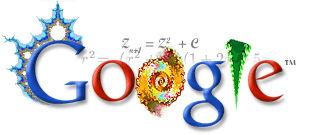
The upshot of creating logos for Google that Google is an extremely popular search engine, receiving several hundred million queries a day, so any artwork on the google search main page will receive a lot of attention, and often Google will include a link to a google search of the holiday or birthday of whomever they are honoring in the logo. 
Another sweet thing that the google holiday logos webpage has added is a fan logos page, which means that not only can Hwang contribute logos to the web giant, but anyone can. These won't be displayed on the main page, but it still includes the user-contributions and interactivity that is an aspect of a lot of digital New Media Art. 

Artists: Nobodyhere.com

Nobodyhere.com is an interactive personal site of an anonymous Dutch artist (s/he gives an email of Nobody@nobodyhere.com) with interactive pages that link to one another, and often involve flash games the viewer interacts with to try to figure out the purpose of the site. The topics of the pages are random, about socks, candy hearts, hermit crabs, and gum pieces. Viewers of the page are allowed to comment on pages and interact--commenters are called 'insects', and choose a bug icon avatar to display. The website is available in Dutch, English, and Japanese, which allows a large readership to interact and understand the website. 
I really enjoy sites in which I can personally interact with such as this one, even if they seem purposeless--one "insect" commented that the website is a "great place to unwind". When I created my journey project, I was specifically inspired by this website, which is why I included sounds and as much interactivity in my site, as well as a convolution of links in the page--one image may link to several pages, a couple of them previous in the chain of links, so the viewer spends a lot of time exploring the site. I was also excited to see that the Netherlands Foundation for Fine Arts, Design and Architecture helped fund this website--it's reassuring to see sites as these officially recognized as art. 

Monday, February 16, 2009

http://www.nytimes.com/2009/02/15/arts/design/15cott.html


"At the same time, if the example of past crises holds true, artists can also take over the factory, make the art industry their own. Collectively and individually they can customize the machinery, alter the modes of distribution, adjust the rate of production to allow for organic growth, for shifts in purpose and direction. They can daydream and concentrate. They can make nothing for a while, or make something and make it wrong, and fail in peace, and start again."

So even though I'll be a poor artist, this is the best time to be an artist because I'll have the most control over my ideas!!

Saturday, February 7, 2009

Artists: Yugo Nakamura, Industrious Clock


Yugo Nakamura's Industrious Clock is a website in which the year, month, date, and time are written out numerically over and over again by the image, where a pencil writes each number, then erases it to write the next one. The seconds go extremely fast, while you have to sit and wait to watch the other digits change. The piece is constantly in flux-every user gets a different experience depending on when he/she visits, how long he/she stays, and if, like me, the viewer constantly refreshes to watch the hand write all the digits at once. 
I like this piece because I've seen it before on the internet, it has become almost viral in the way it is spread, so that most people who spend considerable time on the internet have been linked to the industrious clock. It also reminds me of the Human Clock, where users can contribute images to a dynamic, everchanging clock on the page. 

Tuesday, January 27, 2009

Art Dept Event: Placing Color

Placing Color is the new show that opened in Boyden Gallery January 19th, with an opening on the 21st. All three artists in the show, Carrie Patterson, Kayla Mohammadi, and Brett Baker attended the opening and gave a brief introduction to themselves as artists.

Patterson’s pieces were part of her series about St Francis Xavier Church, a local church in St Mary’s County. Her pieces are her impressions of the church translated into blocks of color—there is the green of the priest’s vestment, yellow of the ripe corn outside the windows of the church. The paintings, Patterson informed in the gallery talk, are exploring the sacred space of the church. To me, she has distilled her visual and emotional experience in the church down to the purest interpretation, one that demands the viewer’s attention.

Kayla Mohammadi is the most representational of all the painters in the show. In her 
paintings, we can still see the ocean viewed through a window, the boxes of a river barge, or a bowl of
 cherries. But these objects can only be discerned through thorough study, the viewer must walk in to the painting and question what he or she is viewing. But what is viewed is eventually translated, as a more colorful version of the space or landscape.

Brett Baker has the most varied series of paintings. He has several small paintings, intensely textured with layers of paint from years of painting on top of one another. They have been so heavily painted that the colors have approached similarity, and with the size of the paintings, they appear to be portraits with the weight of the small paintings. Baker also includes a large installation painting in the show, facing the wall. The corridor of color that is created involves the viewer entering the painting as well, while we approach the painting seeing the skeleton of the painting canvas.

All three artists are colorists—their art has a focus on the color. Yet, the viewer must place oneself within all of the paintings. Mohammadi and Patterson’s paintings describe places, while Baker’s large painting literally creates a new space for the viewer to physically enter and experience. This gives relevance to the name Placing Color, as the artists have tried to place the viewer within the paintings.

Sunday, January 25, 2009

Artists: John Klima


John Klima's Glasbead is a cross-disciplinary work in which multiple users can make music through a visual, interactive interface. Glasbead is inspired by Herman Hesse's novel The Glass Bead Game, where ideas are played like musical notes in a futuristic game. Instead of ideas, users of Klima's Glasbead move stems around in the orb, which play musical tones when hit by hammers also within the orb. 

Klima, a software programmer with a BFA in photography, created Glasbead after freelancing for Microsoft. The piece of art is cross-disciplinary, one characteristic of New Media art, combining programming and visual art to make a program that creates music via a visual interface, with the ability for users to collaborate and have a shared experience with the piece. This piece and artist interested me for these reasons. Many traditional art forms involve an individual experience: the viewer, by oneself, interacts with the art and has a personal experience. With Glasbead, multiple people can experience the same piece and interact with the program and each other. The crossing of disciplines is also very fun for me--this is art that has been programmed, and the visual aspects of the art have a direct connection to sound-music is made by one's placement of the visual component. 

Wednesday, January 21, 2009

sample


this is not a test