Saturday, March 14, 2009
A to Z critique response
After discussion my ideas with the class, I think I'm going to follow through with the holistic idea of bread, water and shelter. I'm really glad Pat suggested that I use the H building as a structure to hold the other two letters, that will tie it in a lot better. There's also the fact that H is my family name, and logically the one that would be biggest and hold the rest of my name within it. I'm not sure how literal I'm going to be with the symbols I use-- the poster I am working on now has pretty derivative versions of the letter, but perhaps in one of the other posters I'll make a more literal versions of the letters.
Tuesday, March 10, 2009
Artists: Etoy.com
 Etoy.com is the result of a group of European artists who created Swiss corporation whose purpose is to make art out of mimicking the corporate world. The site was set up in 1995, and on the site, users could buy stock, and stock certificates would be the art. I think this is also represented in the name of the website-Users use the website like an electronic toy, and the site is mocking corporate culture by calling what they do a toy.
One of the most interesting things I learned about Etoy.com is that it had a domain name battle with Etoys.com in 1999, which Etoy named Toywar. eToys tried to buy out the Etoy domain, but Etoy refused, so eToys sued for copyright infringement. Etoy created an online game in which members could attack eToys and earn points through real-world activities against eToys. Nearly 2,000 people participated in Toywar, and in January 2000, eToys dropped the lawsuit. Etoy takes credit for the $4.5 billion decrease in value of eToys's stock, making Toywar "the most expensive performance in art history".
I love how Etoy is mimicking, twisting, and mocking the corporate world and structures by which it operates. It even came out to the non-digital world with the eToys lawsuit. How Etoy used that real-life lawsuit to further involve users in a game, which then was taken off the website to chatrooms, forums, and other user-created websites is a really innovative use of New Media Art. Etoy shows me how with the internet, it is so easy to have the same power that large corporations have, no matter who I am behind the computer screen.
Wednesday, March 4, 2009
Critique Response: Journey Project
I wanted to create a journey project that kind of got the viewers lost within the site in a journey, so that they may have to re-experience certain pages, like Nobodyhere.com or Jodi.org does. I created that journey with the underwater path--the foot that wanted to go on an adventure. I liked the fact that I would be holding my audience captive in a way, so that it wasn't just a linear journey to the end, and then they were done with it. I'm glad that the class understood what I was trying to do with that, and that it was an effective piece in that way.
One suggestion that I was given was to clarify some of the pages, where you weren't sure where you could click. So, in some pages, like the surfing girls and the baseball player, I added more photoshop graphics that popped up on rollover, to show the different areas one could click on, and that way you had a bit of an idea of where you had been if you were still travelling the circutious loop of the pages. I also tried to unify the pages and images better by giving each page a background, derived from a predominant color in the image.
As for the second journey, the foot that stays at home, I wanted to make this a more direct route. There is a parallel in that you are exploring something (a computer or under water), but I wanted the second journey to differ in that it is more narrative, I address the viewer through text and tell them where to click many times. The computer journey is more literal--I used real images of the insides of a macbook pro, whereas for the underwater journey I took images that were fanciful underwater photography. To reflect the more literal nature of the computer journey, I made the path more straight and assigned myself the role of narrator through the internet.
I really enjoyed this project, and I had pretty high standards for myself when creating the journey project. I wanted it to be entirely engaging to the viewer, something they interacted with and explored not only through seeing the elements and guessing where to click, but with audio as well. I even tried to think of witty titles for each page. Mostly, I wanted to create a website and art piece that will stand on its own outside the context of this class, so that I can take it to my friends or family or strangers, and they can simply enjoy the experience of the journey, without needing to know I created it for a class.
Tuesday, March 3, 2009
Album cover
So I tried out this internet meme:
1 - Go to "wikipedia." Hit “random”
or click http://en.wikipedia.org/wiki/Special:Random
The first random wikipedia article you get is the name of your band.
or click http://en.wikipedia.org/wiki/Special:Random
The first random wikipedia article you get is the name of your band.
2 - Go to "Random quotations"
or click http://www.quotationspage.com/random.php3
The last four or five words of the very last quote of the page is the title of your first album.
3 - Go to flickr and click on “explore the last seven days”
or click http://www.flickr.com/explore/interesting/7days
Third picture, no matter what it is, will be your album cover.
4 - Use photoshop or similar to put it all together.
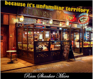 I thought this was kinda neat, a little New Media, and I got to work in Photoshop to create it!
Monday, March 2, 2009
Artists: Yael Kanarek, World of Awe, The Traveler's Journal
 Worldofawe.net, the Traveler's Journal is a New Media art webpage that centers around storytelling and narrative via the idea of the journal. The viewer is placed in an interface similar to a computer's desktop, where hidden in the desktop icons and menubar are links to journal entries, stories, images, and interactive pages where the user has to figure out a puzzle to get the next piece in the narration. The premise of the website is that you have found this laptop, belonging to an anonymous journeyer in a desert land called Sunrise/Sunset, and the files in the laptop allow the viewer to explore the electronic thoughts and love letters of this lost person. In the background, a loop of blowing wind is played.
This project is very reflexive, the viewer is placed in a layout that mimics a computer desktop, and is then explored in desktop icons and the menubar, just as you would explore your own computer. I was drawn to this, and to the ability to explore and gain a story from my exploration of the site. The interactivity of the user with the site is what creates the narrative in this project
A to Z project research
I looked at the Phoenician script to find meanings for my initials at first.


T- "Taw" was originally a cross, more like an "X" than a "T". It literally meant "mark", and indicated a signature. Taw was also the last letter of the Phoenician alphabet, and had a significant role as that. It would be used to signify the end of things.

N-"Nun" was thought to have come from a hieroglyph of a snake, or possibly an eel or fish in water. The snake hieroglyph means "bad luck" in Arabic.

H- "Heth" originates in a hieroglyph for "courtyard", and is written the same in early
Greek, when it meant "fence"
Amusingly, I found the hebrew derivation of Heth, Chet, is used in chatrooms to designate laughter, similar to LOL.
Outside of the Phoenician alphabet, I found that the Egyptian nu was a wavy line that represented water, similar to N. T reprsented a loaf of bread, and H represented shelter.


"T N H" in hieroglyphs.
I think that even though I did a lot of research into the Phoenician alphabet, I am more drawn to the Egyptian hieroglyphs. It's older, some of the Phoenician is derived from these hieroglyphs, and there is a uniformity with bread, water and shelter-- they are basic needs for survival, when summarized.
So, working in Illustrator, I threw together some literal transcriptions of the Hieroglyphs and my letters:

 T was the easiest: a loaf of bread, easily replicated as a pattern on the letter.


 N was more difficult, and I came up with a couple ideas. The font I used for the letter 'N' was very curly and made me think of the movement of water, which is why the second gif is just blue wavy and curly lines. I also mimicked the hieroglyph's shape of water. Then, I tried to emphasize where the "N" shape could have come from in the shape of the waves and water.


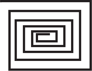
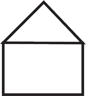 I would say I have the least ideas for the H. I tried the hieroglyph's shape of 'shelter', and elaborated on it to make it a more complex shape, and then drew a symbol version of a house.


"T N H" in hieroglyphs.
I think that even though I did a lot of research into the Phoenician alphabet, I am more drawn to the Egyptian hieroglyphs. It's older, some of the Phoenician is derived from these hieroglyphs, and there is a uniformity with bread, water and shelter-- they are basic needs for survival, when summarized.
So, working in Illustrator, I threw together some literal transcriptions of the Hieroglyphs and my letters:

 T was the easiest: a loaf of bread, easily replicated as a pattern on the letter.


 N was more difficult, and I came up with a couple ideas. The font I used for the letter 'N' was very curly and made me think of the movement of water, which is why the second gif is just blue wavy and curly lines. I also mimicked the hieroglyph's shape of water. Then, I tried to emphasize where the "N" shape could have come from in the shape of the waves and water.


 I would say I have the least ideas for the H. I tried the hieroglyph's shape of 'shelter', and elaborated on it to make it a more complex shape, and then drew a symbol version of a house.
Subscribe to:
Comments (Atom)